
The Appearance API
A theming standard for styling any component in our component library
Customization of your component integration is managed via the Payment Enablement Appearance API. The Appearance API provides a theming standard for styling any component in our component library.
Component Studio
Visit the component studio to easily style the appearance of your components.
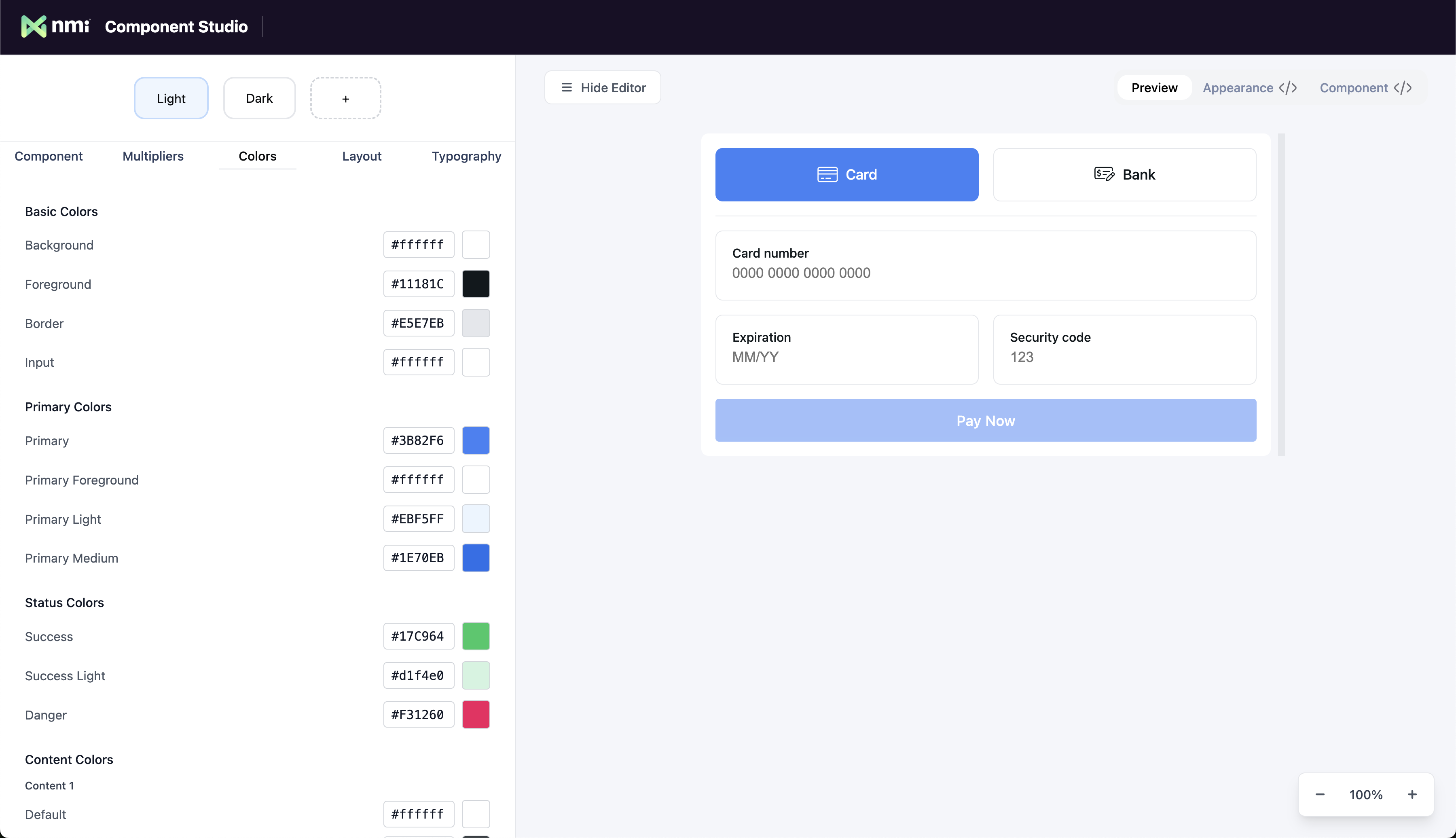
After you are done customizing the look and feel of your component, selecting the code tab will show you your Appearance object. This object is then passed to your payment component as a prop to apply your theme.
Appearance Configuration
Theme Customization
The Appearance object contains comprehensive theming options including colors, typography, spacing, borders, and effects. You can customize every aspect of your component's visual appearance.
Integration
Simply pass your customized appearance object to your component as the appearance prop to apply your theme.
Built-in Themes & Modifiers
Choose from pre-built themes like 'light' and 'dark' for quick setup. You can also use modifier properties to make rapid adjustments to the overall look and feel without needing to customize individual values.
This approach allows you to start with a solid foundation and make targeted tweaks rather than building everything from scratch.
The Appearance Object Type
The entire appearance object type looks as follows. We recommend using the component studio to generate the appearance object to match the look and feel of your application.
interface Appearance {
  theme?: 'light' | 'dark';
  customTheme?: Partial<USER.CAMELCOMPONENTPREFIXTheme>;
  layoutSpacing?: 'compact' | 'default' | 'spacious';
  textSize?: 'smaller' | 'default' | 'larger';
  radiusSize?: 'none' | 'smaller' | 'default' | 'larger';
}PeTheme Interface:
interface USER.CAMELCOMPONENTPREFIXTheme {
  layout: USER.CAMELCOMPONENTPREFIXLayoutTheme;
  typography: USER.CAMELCOMPONENTPREFIXTypographyTheme;
  colors: USER.CAMELCOMPONENTPREFIXColorsTheme;
}PeLayoutTheme Interface:
interface USER.CAMELCOMPONENTPREFIXLayoutTheme {
  radius: {
    small: string;
    medium: string;
    large: string;
  };
  borderWidth: {
    small: string;
    medium: string;
    large: string;
  };
  spacing: {
    padding: string;
    xs: string;
    sm: string;
    md: string;
    lg: string;
    xl: string;
    '2xl': string;
    '3xl': string;
  };
}PeTypographyTheme Interface:
interface USER.CAMELCOMPONENTPREFIXTypographyTheme {
  size: {
    xs: string;
    sm: string;
    md: string;
    lg: string;
    xl: string;
    '2xl': string;
  };
  weight: {
    light: string;
    medium: string;
    bold: string;
  };
  font: {
    sans: string;
    mono: string;
  };
}PeColorsTheme Interface:
interface USER.CAMELCOMPONENTPREFIXColorsTheme extends USER.CAMELCOMPONENTPREFIXSemanticColors, USER.CAMELCOMPONENTPREFIXContentColors {
  background: string;
  foreground: string;
  border: string;
  input: string;
}PeSemanticColors Interface:
interface USER.CAMELCOMPONENTPREFIXSemanticColors {
  primary: USER.CAMELCOMPONENTPREFIXColorScale;
  secondary: USER.CAMELCOMPONENTPREFIXColorScale;
  success: USER.CAMELCOMPONENTPREFIXColorScale;
  warning: USER.CAMELCOMPONENTPREFIXColorScale;
  danger: USER.CAMELCOMPONENTPREFIXColorScale;
  default: USER.CAMELCOMPONENTPREFIXColorScale;
}PeContentColors Interface:
interface USER.CAMELCOMPONENTPREFIXContentColors {
  content1: USER.CAMELCOMPONENTPREFIXColorScale;
  content2: USER.CAMELCOMPONENTPREFIXColorScale;
}PeColorScale Interface:
interface USER.CAMELCOMPONENTPREFIXColorScale extends USER.CAMELCOMPONENTPREFIXColorPair {
  100: string;
  200: string;
}PeColorPair Interface:
interface USER.CAMELCOMPONENTPREFIXColorPair {
  default: string;
  foreground: string;
}Tip: You can use the appearance object generated by the component studio with any Payment Enablement component. It is recommended to share the same appearance object with multiple component integrations to achieve a consistent look and feel across your application.
Updated 42 minutes ago